Services
Client
Year
Challenge
As a debut event, TwentiesFest had no prior brand equity to lean on. It needed to enter a saturated festival market with an identity that felt instantly credible, gender-neutral, and bold.
The challenge was to create a visual system that captured the dual nature of the event: it needed to be informative and “life hack” oriented, yet vibrant and “party ready.”
Goal
The objective was to build cultural relevance from day one. The brand needed to: Communicate a bold, energetic, and inclusive ethos. Stand out with significant visual impact across both digital social feeds and physical print. Foster an immediate sense of belonging and "movement" rather than just a one-off ticket sale.
The impact
The TwentiesFest brand launched with an "electric" response, successfully converting a podcast audience into a live event movement:
Turned a Festival into a Movement: The cohesive identity gave TwentiesFest instant recognisability and credibility in its inaugural year, helping it cut through the noise of established events.
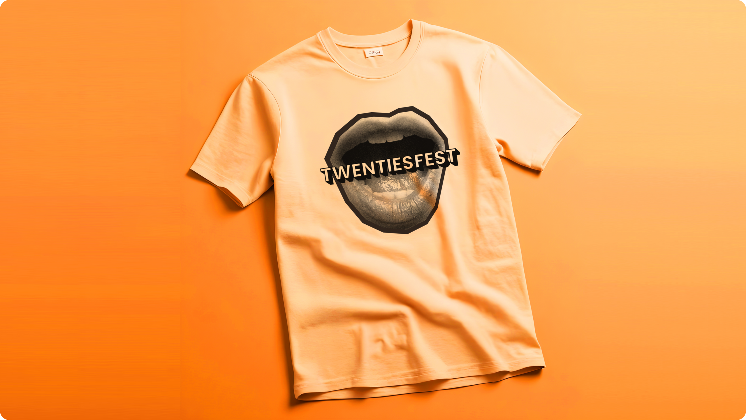
Activated a Loyal Community: The brand’s emotional resonance drove intense organic promotion and word-of-mouth buzz, leading to strong demand for pre-event merchandise.
Delivered Immediate Commercial Success: The clarity of the brand directly supported business outcomes, translating high digital engagement into advanced ticket sales and establishing a sustainable model for future years.
Established a Unique Category: TwentiesFest successfully claimed the space as the definitive destination for “navigating your twenties,” proving that brand-led events can build deep affinity faster than traditional marketing alone.
The approach
Against Ordinary crafted a disruptive brand identity rooted in the nuances of modern youth culture:
Embedded Cultural Nuances: We designed an identity that felt familiar yet aspirational, reflecting the shared language and aesthetics of life in your 20s.
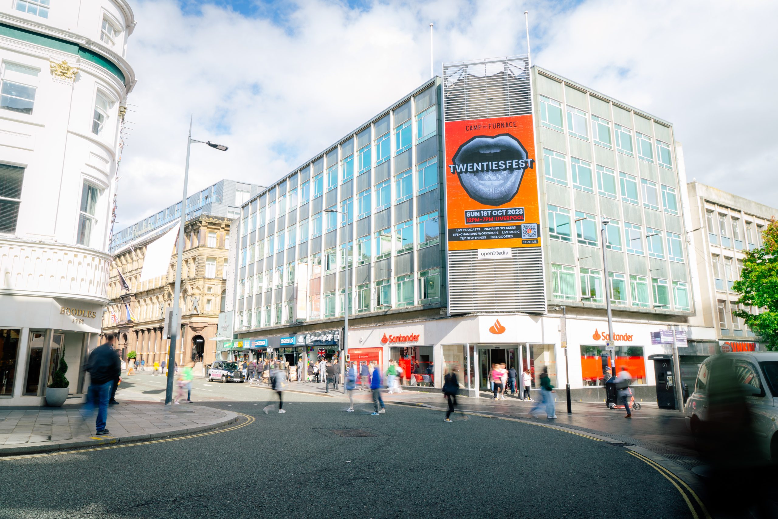
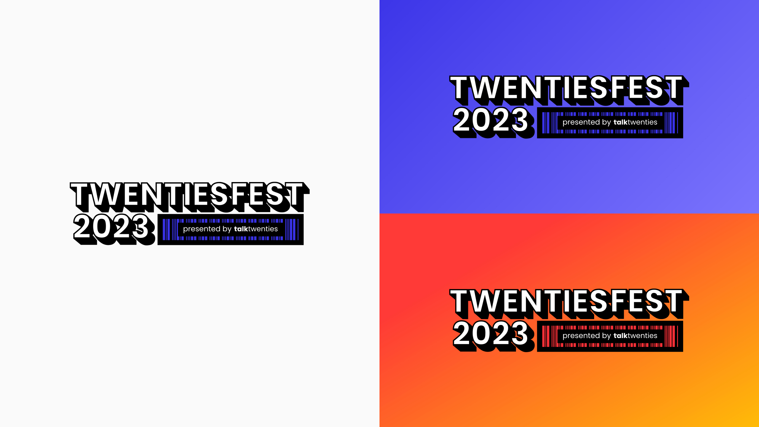
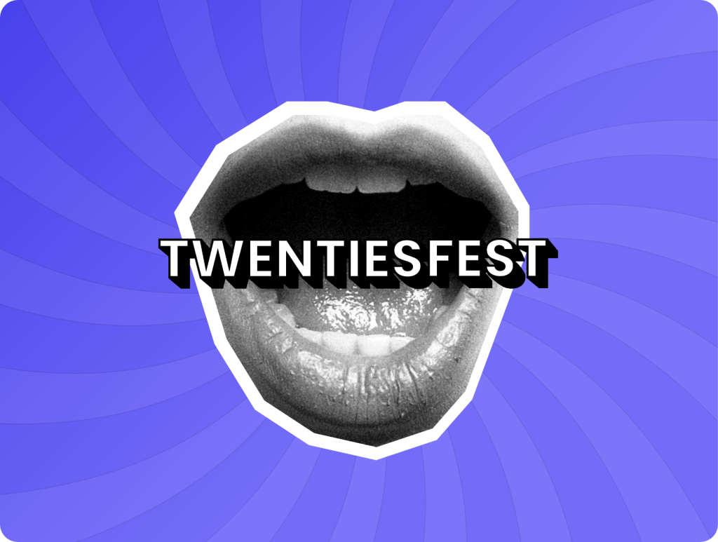
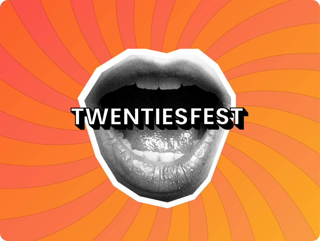
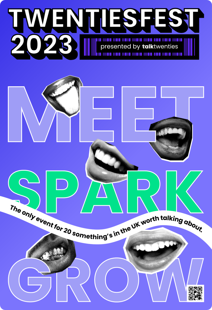
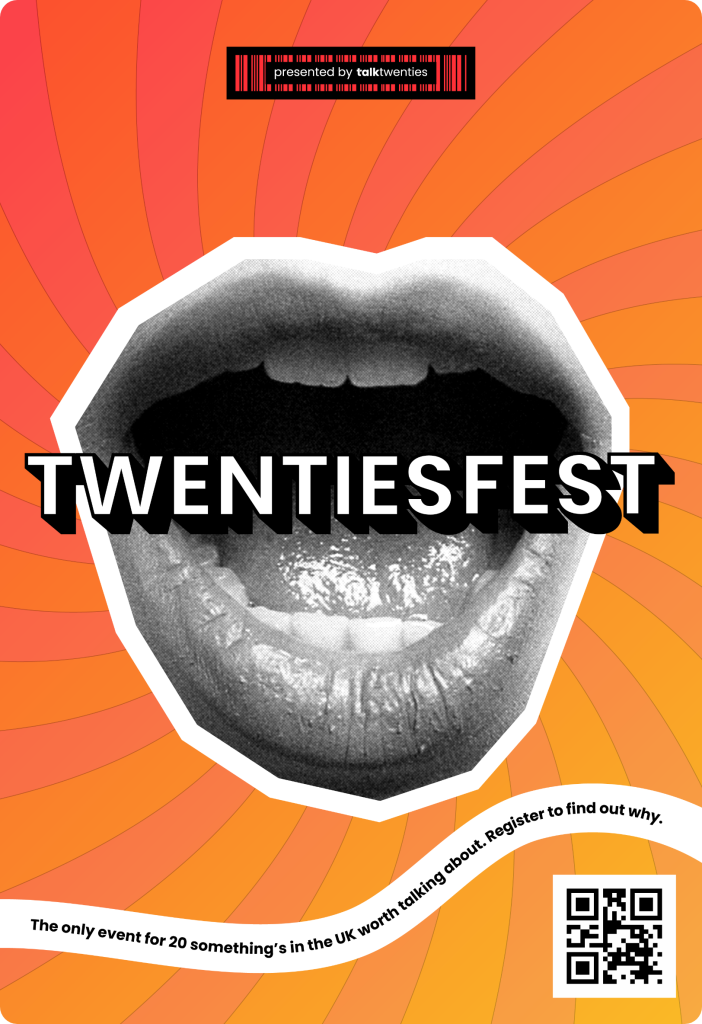
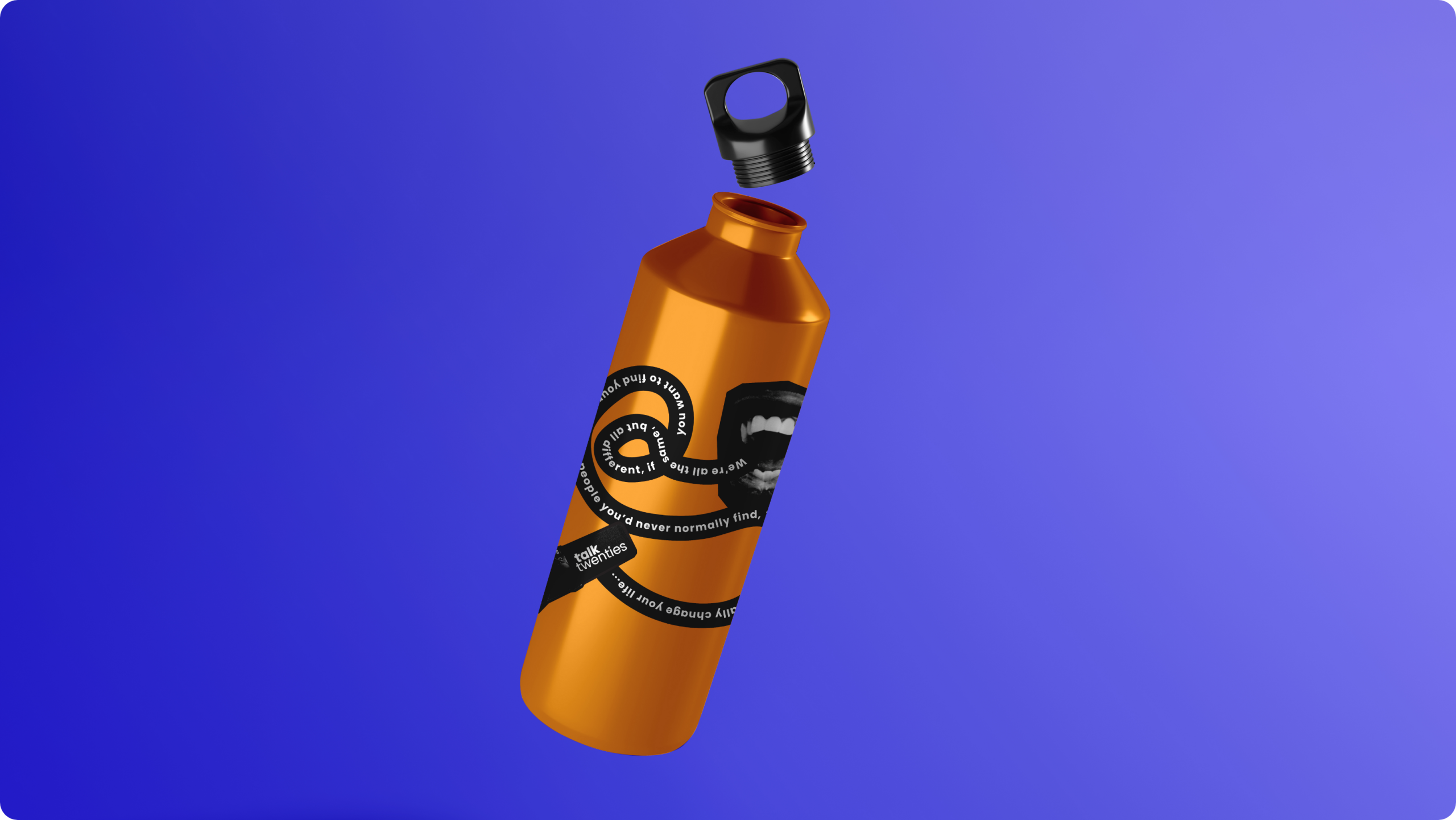
Created Symbols of Belonging: We introduced distinctive visual elements like the barcode and cut-out mouth graphics that served as icons of individuality. These weren’t just designs; they were badges of shared experience.
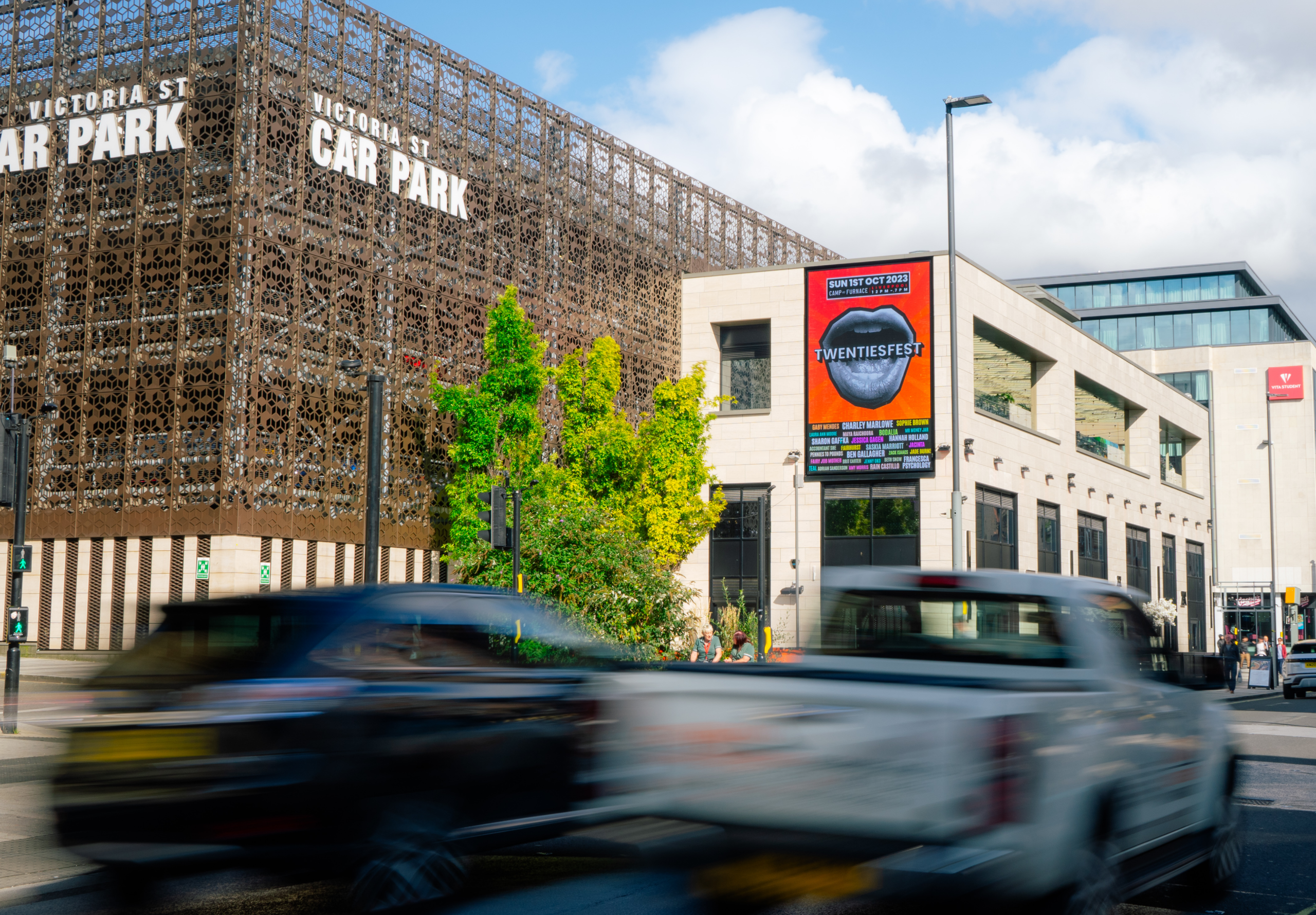
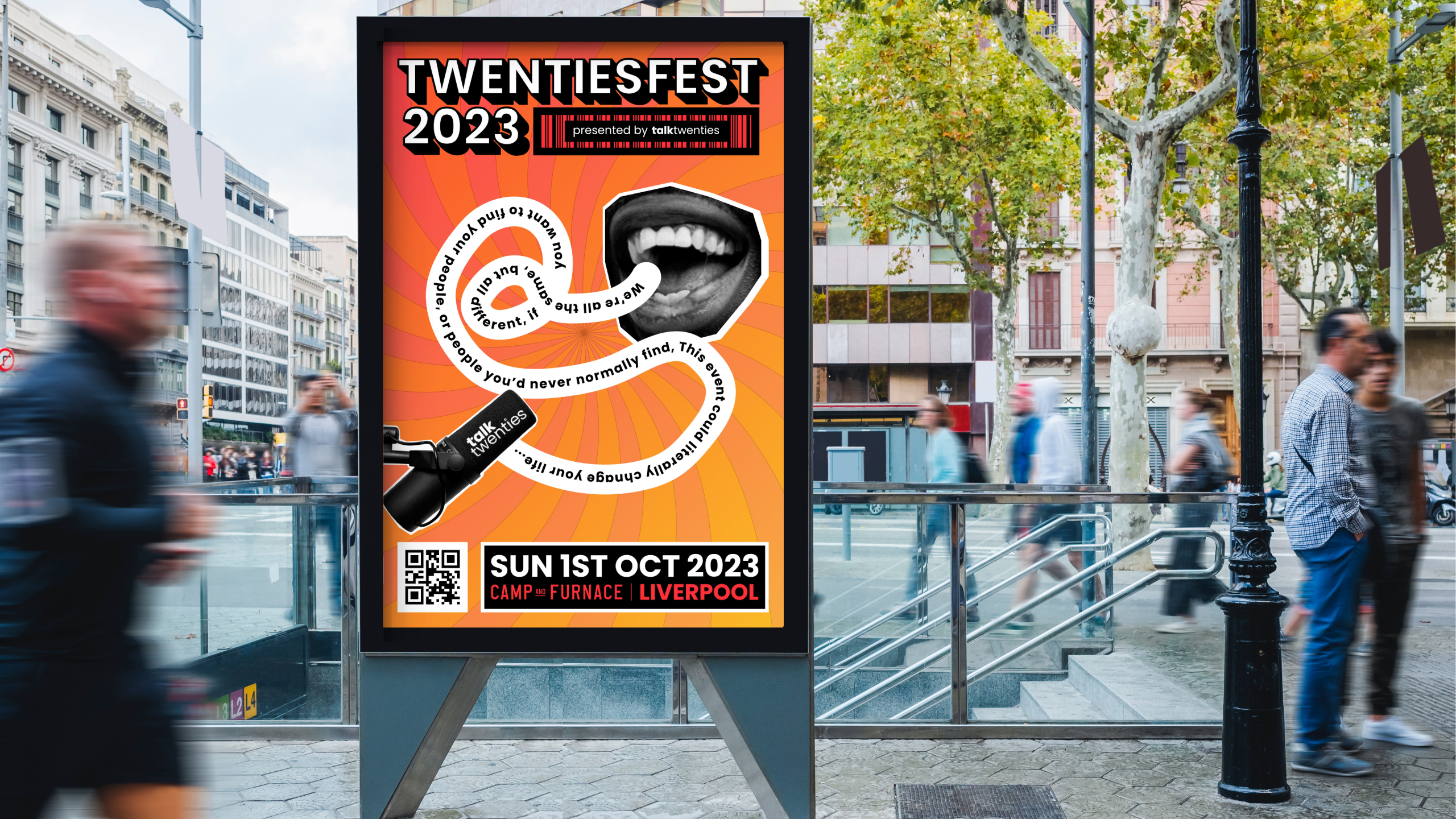
Designed for “Loud” Impact: We developed a gender-neutral, high-contrast visual system designed to stop the scroll on social media and provide high-visibility “stopping power” in urban environments.
Sparked Organic Hype: By focusing on community engagement early on, we created merchandise and digital teasers that turned the festival into a conversation starter months before doors opened.